One of my most popular tips is an oldie, Easy Web Tip #53. In it I advised that folks put one space after a period instead of two, which was the standard in the era of the typewriter.
But in the post-typewriter age, two spaces after a period is outdated. Modern word-processing seemed to eliminate the need.

Well, now, I must amend my advice.
Whether you put one space or two after a period depends. It depends upon your font.
I discovered this while working on a new website with a font that turns my prior advice upside down. It’s a very popular web font used today. It’s called Lato.
When you type in one space after a period, the Lato font has very little space between the period and the first letter of the next word. So this font requires two spaces after a period.
Here’s what I mean …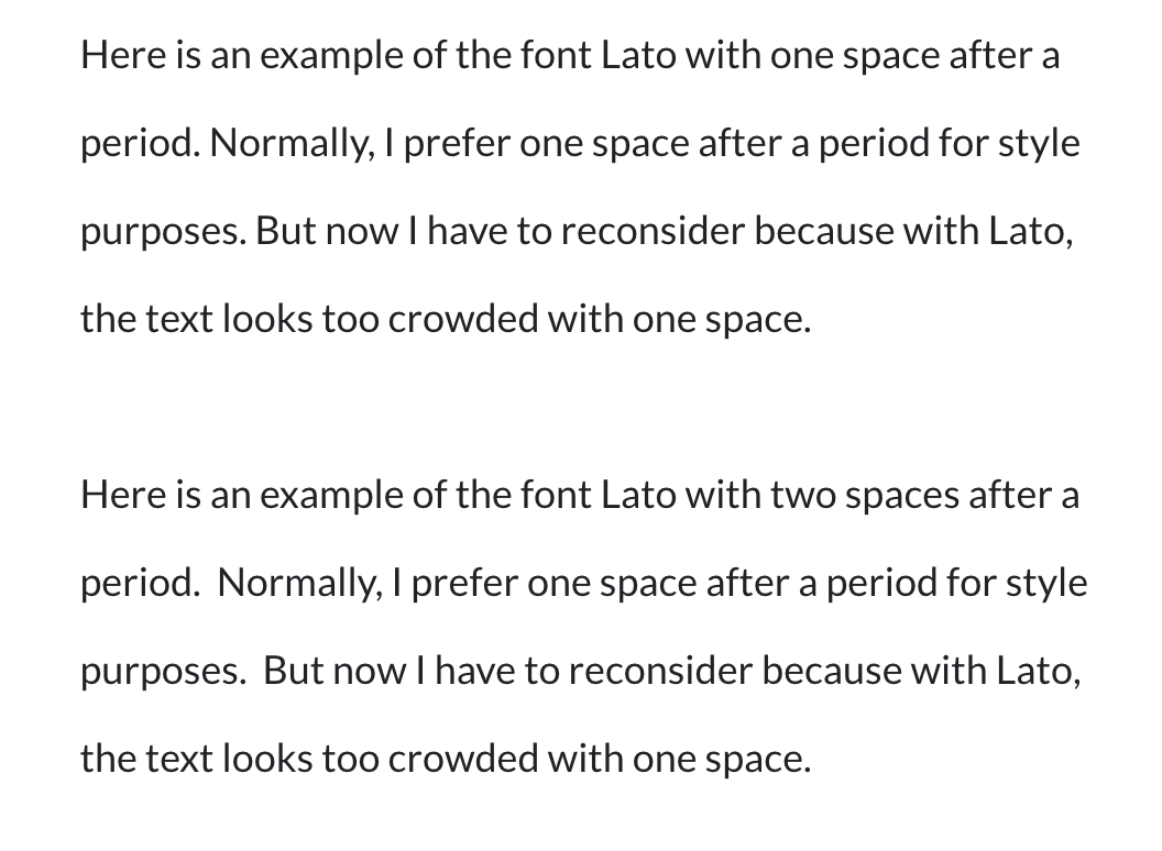
The developer of this font must have developed it with the person who taps the space bar twice in mind. Or maybe the developer just prefers a tighter spacing.
This is going to be a bit difficult for all of us going forward. We’re going to have to look at the proposed font style for a new web site or document and adjust our typing accordingly.
Or we can just use one of the old-school fonts like Arial or Verdana or Georgia and continue as before.
I wonder if there are any other fonts like Lato that are better with the old-school spacing.
Easy Web Tip 286: When rebuilding your website, be sure to check whether your site’s font style looks best with one-space or two-spaces after a period.