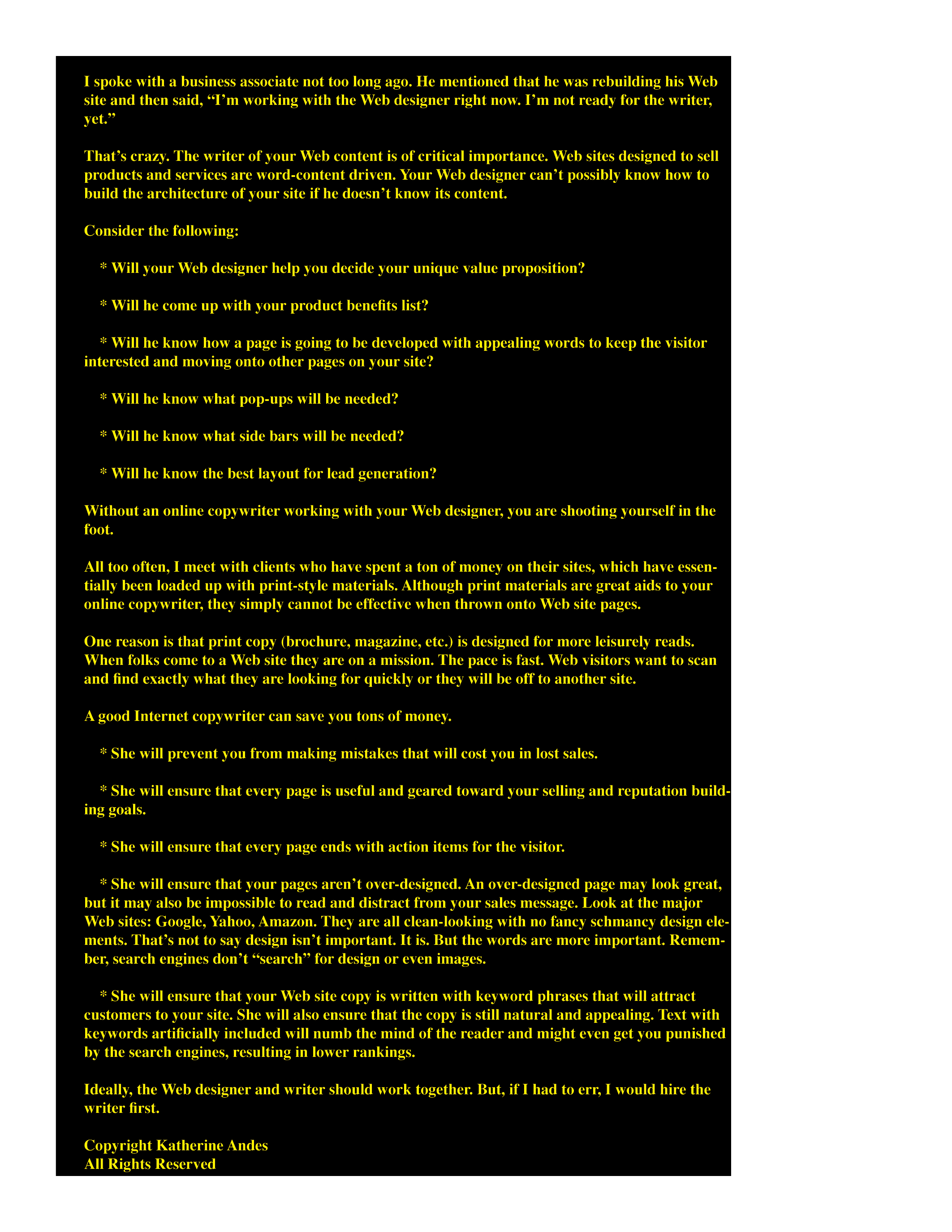
REVERSE TYPE is light or bright letters against a dark background. It is difficult for the reader to read and can even hurt his eyes.
Below is a sample of reverse type. Graphic designers often love the “look.”
Though this is fine for short headlines, it should not be used for long copy. It is not legible and readers will click away from your site.


