Recently, someone asked me to review a home page for a new site that was a work-in-progress. The owner knew that something was wrong. But she couldn’t quite put her finger on it.
I looked at the home page and immediately saw that the design and content was simply too busy with no focus.

The company provided a number of services that although related, were distinctly different.
Some companies have so much to sell and so many stakeholders to please that a description and link to everything is somehow crammed onto the home page.
This can be very unattractive and a turn-off to your visitor
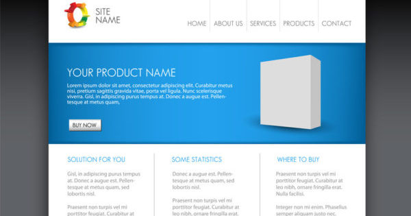
Rather, design the optimum home page by determining three or four general overall categories and have an attractive box with a brief description and link to another page. This sub-page can then introduce the category with appropriate sub-links.
It may be hard to tell a department head that, no, there won’t be a unique button to his page on the home page. But stick to your guns. It will do him and your whole company good.
Easy Web Tip #46: You can make your home page better by keeping it clean and uncluttered. That way visitors can quickly find their unique areas of interest.


