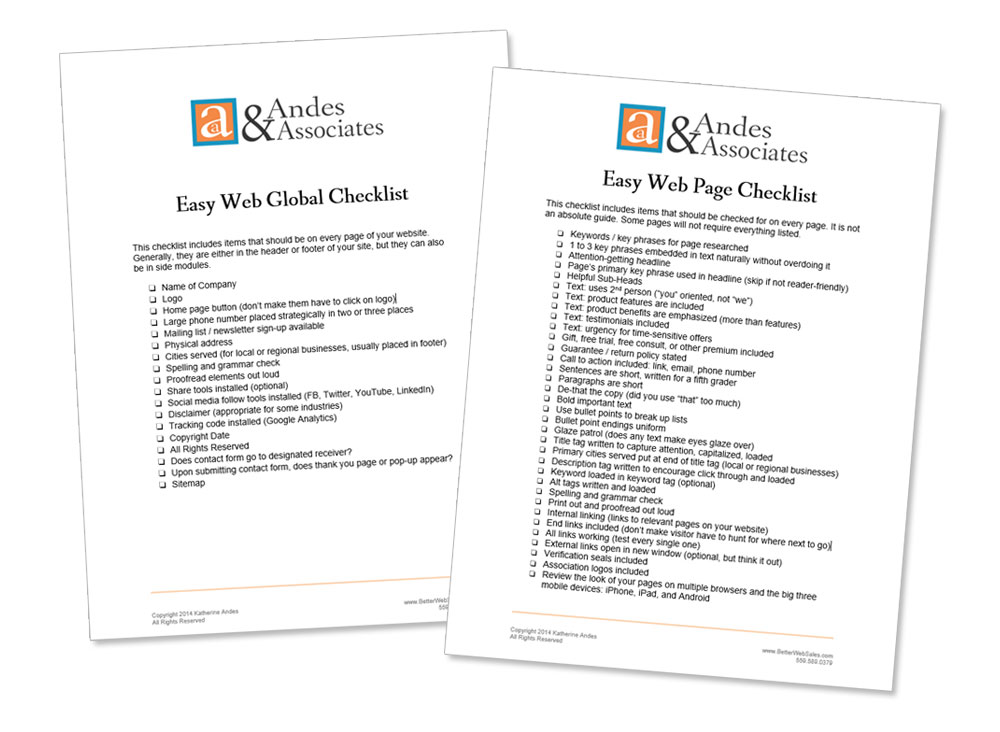
Okay, I’m old school. I admit it. I like to have a button at the top left of a web page that clearly says HOME.
If I’m on an unfamiliar website and can’t get my bearings for any reason, I can always click HOME and start over.
A HOME button makes me feel secure. For most people, just the name “home” evokes feelings of comfort, safety, and happiness.

For the past several years, web designers have been retiring the HOME button in favor of having folks click on the logo.
I don’t like it.
Here’s why. A lot of folks are still “old school” like me. Sure, we’ve learned that if there’s no HOME button, we should click on the logo. But it’s a slight hindrance and annoyance.
You don’t want your visitors to be hindered and annoyed. Even if it’s ever so slightly.
In addition, why would you deprive your visitors of the pleasant sensation that just seeing the word “home” inspires?
What do you think?
Easy Furniture Web Tip 244: Be “old school” and include a HOME button on your website.


