In the good old days, when you launched a new or revised website, you just needed to check and review your web pages on your desktop computer.

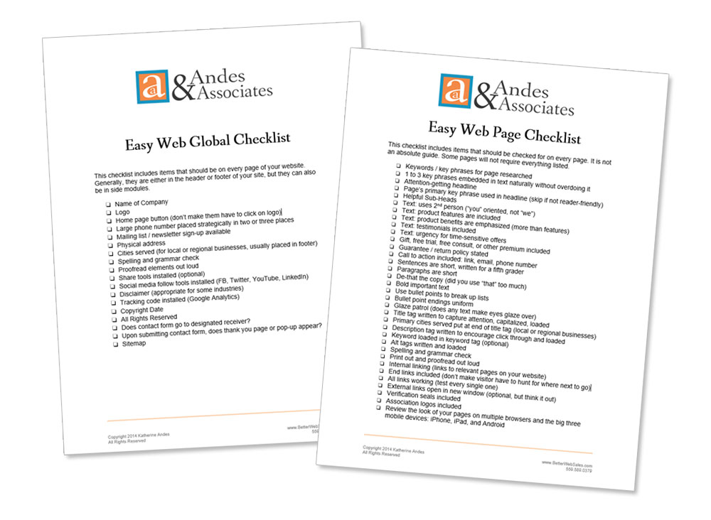
A thorough review includes checking for items like …
- Does your web content looks right?
- Does every single link go to the correct page?
- Is a call to action included?
- Are social share tools installed?
- Are all your tags loaded correctly?
Plus it’s important you check every single page of your website in this manner. Of course, if you have thousands of product pages, then you simply check your custom pages and the “container” for the product pages.
But that doesn’t end your review. You need to repeat this check with respect to how your content looks on various browsers. What looks great in Explorer might not look good in Safari or Chrome.
Today, the above tasks have gotten harder. Besides checking different browsers, you now need to check and see how your pages are viewed on multiple mobile devices.
You will be surprised how many things go wonky on the different devices. As an example, one client had an image with text below it that looked just fine on his desktop, iPad, and iPhone. But on an Android, the text floated up to the top of the image and was out of place.
While it is unwieldy to check for every type of mobile device out there, you should check for the big three:
- iPhone
- iPad
- Android
Usually, when I’m working on a new website, I have different people checking out the pages. I have an Android phone so I check that. The client might have an iPad, so he checks out that. The web developer might have an iPhone so he checks on his end.
Once you identify glitches, your web developer should be able to address each of them and fix them.
Easy Web Tip #194: Carefully check your new website’s pages on mobile devices.


