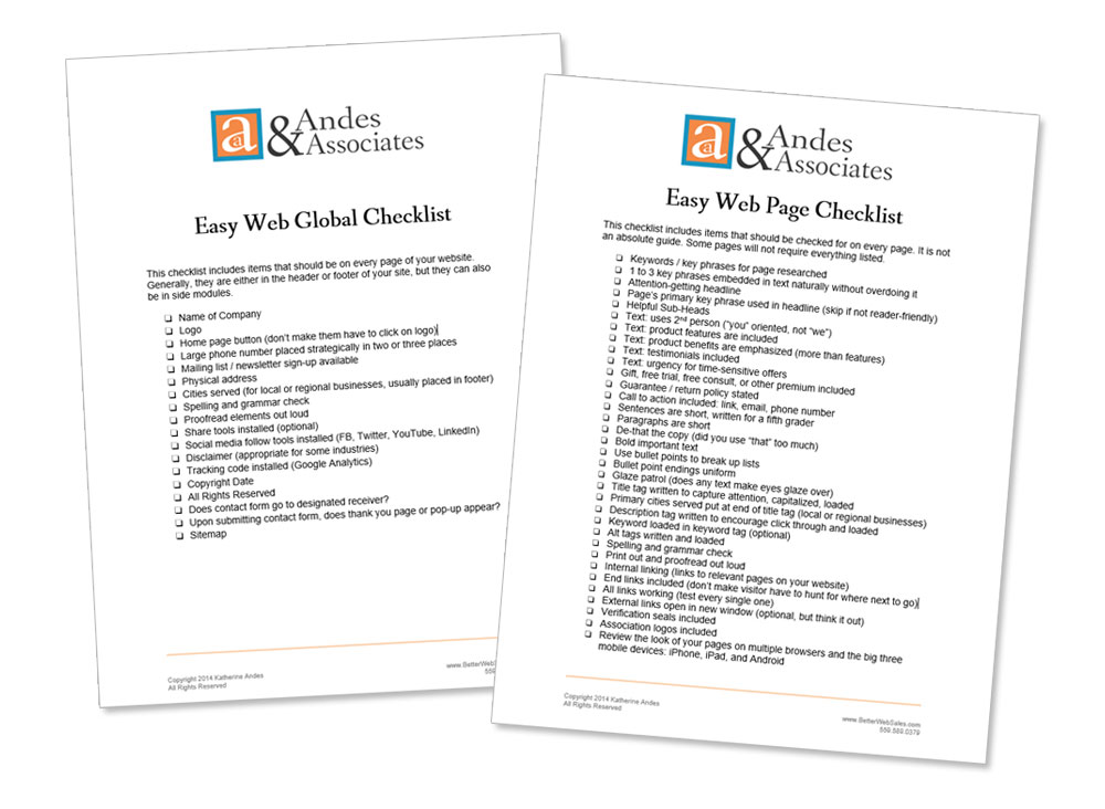
I’ve noticed that a lot of web sites these days are opting to not have a button labeled HOME for their home pages.
Sometimes the button for the page is given another name, like the name of the company or the main product.

Other times, there is no button that goes back to the home page at all. But maybe if I click on the logo way up in the banner, I can get back to it.
I suppose the web designer is trying to be creative and not do what everyone else does. But making your home page hard to find is not the place to be creative.
You know how easy it can be to “get lost” on a web site. It’s very frustrating.
So the idea of a “home page” — that someone can always click back to — is psychologically very powerful to your visitors.
If there is no home page button clearly visible, your visitor has to look and frantically click around to try and figure out how to get back home.
It can be worse than frustrating for the user. It can be annoying. And that’s the last thing you want because he or she might simply click away and never come back.
EASY WEB TIP #51: It may seem elementary, but many businesses don’t do this: Always have a button clearly marked HOME so that people can get back to your home page.


