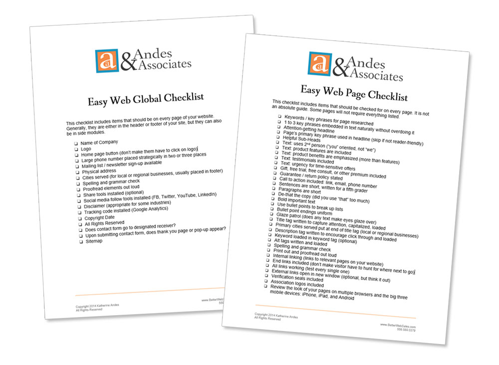
For some time now, designers don’t like to have a HOME link in the top horizontal menu. They prefer to have folks click on the logo to return to the Home page.
I may just be old school, but I’ve never liked this practice.
Here’s why.

Often the Home page is the very first page folks land on when they come to your site. If they stay on your site, it’s because of something they saw on the Home page to encourage them to click through.
Now, when your shopper is on that next page, maybe she doesn’t exactly find what she was looking for. Maybe it was a coupon or a guarantee. She wants to go back to the home page to find out.
She looks up at the top menu. Nothing. She pauses. “What the heck?” Then she thinks. “Oh, I probably have to click the logo.”
Sure, she figures it out and clicks the logo, but there was a significant pause in her energy and a significant irritation registered in her psyche.
Any negative feeling in your customer is not a good thing.
The goal of a business website is to provide as seamless, smooth, and pleasant an experience as possible.
In addition, I’m not so sure EVERYBODY knows to click on the logo.
I’m curious. How many of you stall a bit when you try to return to the Home page of a website? Are you like me that you have to think to click the logo? Am I crazy? If so, I’ll never write about this topic again.
Easy Web Tip 315: Help your customers when they want to go back to your Home page by including a HOME button in your top menu bar.
P.S. I received this in response to my post: “Thank you for this, Kathy! I never knew you needed to click the logo. Sometimes, I just give up.”


