Recently, I’ve signed some new clients who have complained that their websites have had zero or few contact forms filled out and submitted to them.
Often when I look at the page with the contact form, I immediately see part of the problem.

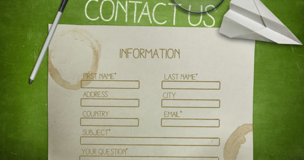
The forms are simply too long. They may be asking perfectly valid questions for the business like how many rooms are you thinking of furnishing? Or what style of furniture do you like?
But for some reason, the more people have to type in a contact form, the more likely they are to abandon it and the website all together.
This is especially true if you start asking for a physical address and phone number.
Visitors hate that.
Sure it would be nice to have a physical address to build your direct mailing list, but your initial contact with a customer via a website is not the place to build that list.
Personally, I like to require only one thing: an email address.
Obviously, a store or business can’t email you without an email address.
I like to also have a box for first and last names and a leave-a-comment box. But these fields are optional.
And for those customers who are averse to filling in any form whatsoever, simply make sure an email address is also displayed so that they can just write you directly.
Easy Web Tip #42: There are many things that affect whether or not someone will sign up to receive information from you in the future or to directly request information now. But making sure you have a short and sweet contact form is a great place to start.


